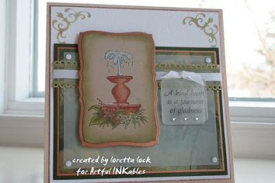
 Coloring on Kraft Tutorial- by Loretta Lock
First off, I want to say I’m not a Prismacolor expert. I’ve used them for about 25 years and I’ve experimented a lot and so I’m comfortable with how I use them. There is no right or wrong way to use them, just different. There are many tutorials for using Prismacolors, and I’m thankful to you for reading mine.
I use dark dye ink to stamp my images for Prismacolors. I find I’m impatient and so I don’t use pigment ink because I would have to wait for it to dry OR I would have to heat set it and I’m still impatient and there are too many steps involved. I’ve tried using emboss powder with pigment, then colouring, but the Prismacolors take the melted powder off the paper.
I love the way Prismacolors and kraft paper mix and mingle. Of course, I love Prismacolors on white paper too, but there is something that happens that is magical about Kraft paper and Prismacolors!

I often choose my colours based on the designer paper I’m using so the project is cohesive in appearance. I typically choose a light and dark of each colour I use unless it is for a large area. I will then choose a light, medium and a dark of similar colours (ie. Limepeel and Moss Green, Crimson Lake and Pink, Kelly Green and Celadon Green, etc)

I often work on a single area at a time to completion (ie. just the fountain, just the water, etc) but for this tutorial and the sake of brevity, I have first coloured all the dark areas. The fountain was coloured with the dark and light colours (shadows and highlights). In the places I want deeper shading, I colour more heavily with the Prismacolors and for the rest of the shadows, colour with a bit lighter hand so the colour looks a bit ‘grainy’. This will allow the colours to blend well.

Next, fill in the remainder of the image with the lighter colours, or medium colour for the fountain, slightly overlapping the colours in the ‘grainy’ areas. It looks pretty darn good as is! It has a bit rougher, artistic look to it and if you like it like this, leave it alone – it’s all good!

I don’t use Gamsol or other odourless mineral spirits very much anymore. I find even odourless spirits have a slight odor which I can’t tolerate well. And this last step is where magic happens! I use the Prismacolors colourless blender to blend the colours. I do one area at a time, working from light to dark. If I get a coloured wax build up on the blender, I clean if off on some scrap paper, much like using a blender pen. One of my favourite final touches is highlighting the image with white gel pen. The white really pops on the kraft paper and in this image it gives a little extra life to the water in the fountain.

Card made using the new Artful INKables Greek Gardens stamp set.
9 comments:
Wow, this card is gorgeous! You did a fabulous job coloring! I haven't used my pencils in ages, but then I could never color this good. :D
Thank you for sharing this great tutorial, Loretta! I found lots of new information for myself!
Your card is gorgeous! You really do the most elegant cards!
Great Job Loretta!! This card is just beautiful!
Ooh, I love that! I like to use my pencils, but never thought about using them like this! Great tutorial! I'll definitely try it. Thanks so much for sharing!
Hugs, Linda
This IS stunning! I never think to use my pencils on Kraft.....I will now!!!
Great card, thanks for sharing your tips. What pencil sharpener do you use for your pencils?
Awesome tutorial, Loretta! I have not tried this particular technique before, but I love the look of the color on kraft! I will be bookmarking this one, for sure!
late to the party! FAB technique Loretta! BEAUTIFUL card!!
A wonderful card with very nice colouring! I love it!!
Hugs Mia
Post a Comment