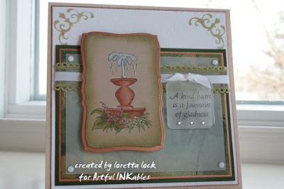
The first card uses the new AI Greek Gardens stamp set. I did alot of coloring on this one and I tried my best to make the columns and the fountain look like they are made from aged copper.
 I did this using Copic markers in BG13 and BG11, with a bit of patina added using E55. I actually stamped the column 4 times since it isnt tall enough to cover an A2 card's background and I cut them to make them look a bit taller. For the focal point I double layered it, added some square clips because they look kinda like a Greek key and beaded the foliage in the front, because I like tedious work, lol! It took a long time but it was time I enjoyed. Here is a close-up of the beaded area.
The second card didnt take me nearly as long but it was equally enjoyable because I had fun making the intended images into something else. I used our new Three Wishes set which has sort of an Arabian Knights theme and gave a couple of the images a different flavor. I made the genie's bottle into a vase and the sun image was stamped 3 times to create flowers. Coloring this was easy, I just used a deep yellow maker over all the image, and outlined it with a darker mustard color. Then I added mustard dots in the center, outlined a bit closer to the edge in dark grey and added more dots. Then to pull it all together, I used a lighter mustard around the petals, so it looks like they are part of the center. I drew my own stems and added some shadow, then Voila...a vase of sunflowers!

For the background, I just cut up some Marrakech paper by Basic Grey and glued it on the back layer with spaces in between to give it a grout-like look. To finish it off, I corner punched the mustard paper and added some orange and yellow jewels.
Oh and one more thing...the Blog Hop Candy winner has been announced over on Kerri's blog. Congratulations to #30~Marie/bat3!
 Coloring on Kraft Tutorial- by Loretta Lock


